
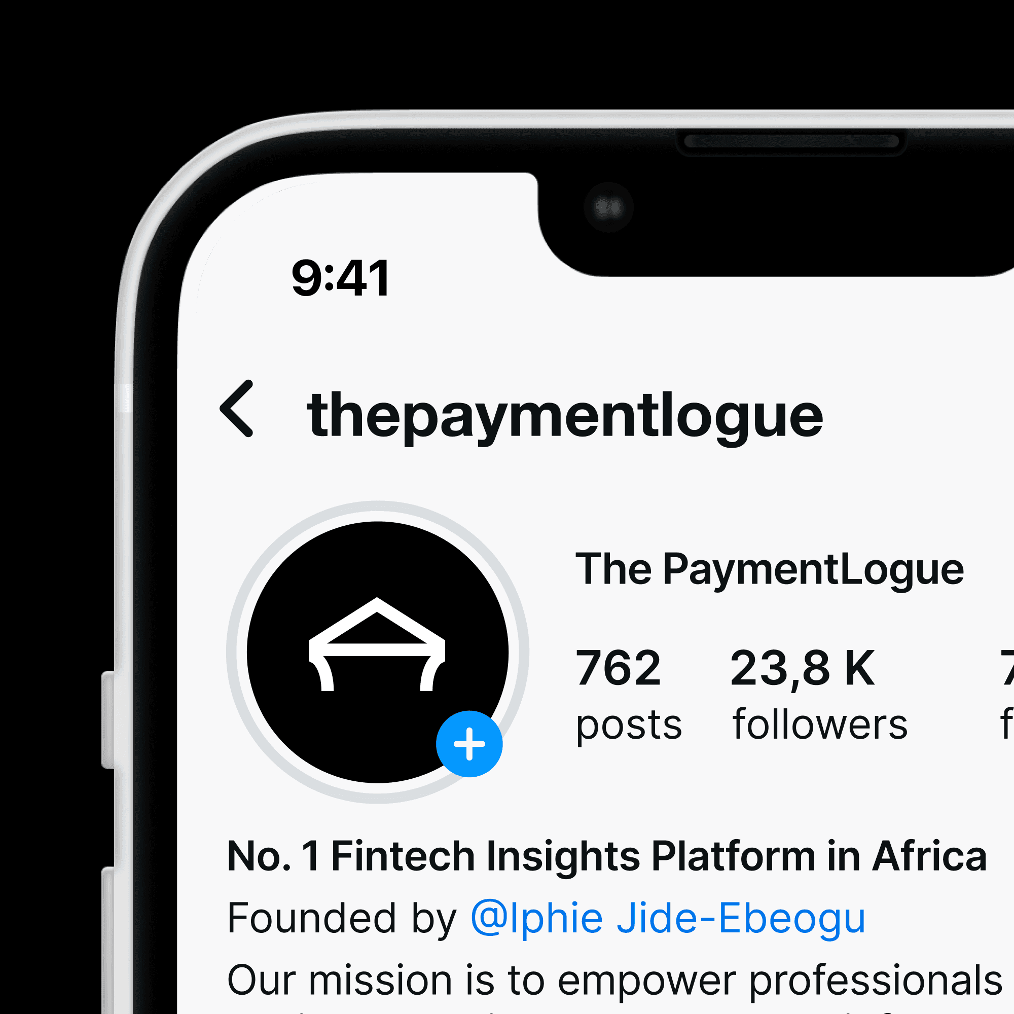
The PaymentLogue
Identity
Infographics
Guidelines
Collaborators
Ayoola Felix, Project director,
Website design, Webflow development
Winifred Òdúnóku, Copywriting
Harrison Osagie, Illustration
Year
2025
Role
Design & Art Direction
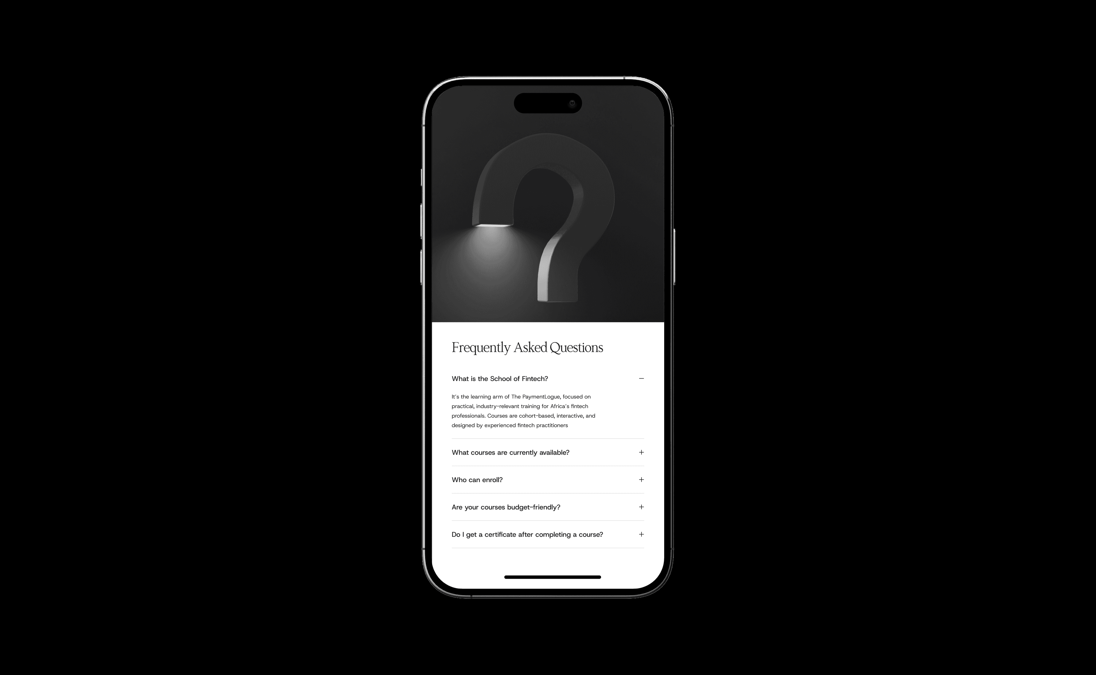
The Question
What does clarity look like in an industry
built on complexity?
What does clarity look like in an industry built on complexity?
Context
In a world where payments move at the
speed of code and financial systems evolve faster than regulation can follow, expertise can easily get lost in noise.
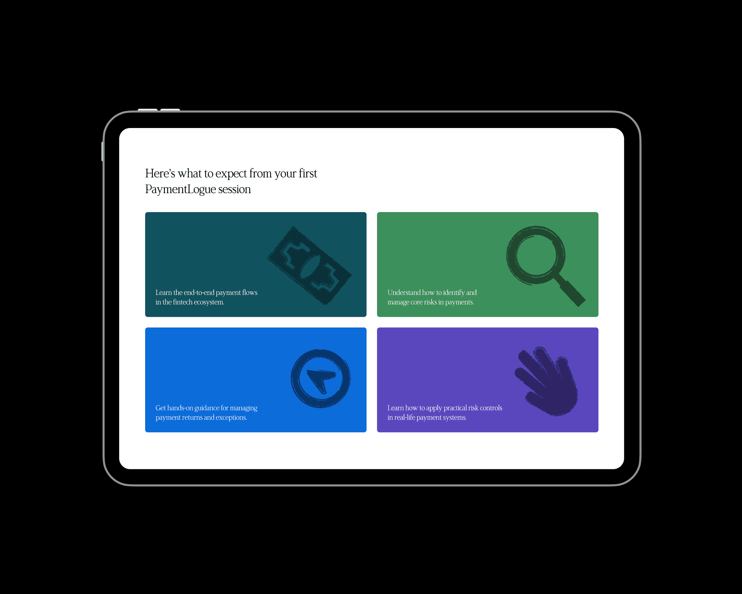
It is a fintech education platform focused
on equipping African professionals with practical knowledge in payments, digital finance, and financial technology. Through expert-led courses and structured learning resources, they transform complex industry concepts into accessible, actionable insight.
As the organization evolved, its brand no longer reflected the authority of its work.
The identity felt informal and fragmented, while the platform itself had grown into a serious hub for fintech expertise. They
wanted a rebrand that would communicate sophistication, structure, and credibility;
one that positioned them clearly as the
go-to source for fintech insights.
The task was to build a visual and strategic identity that matched their ambition: confident, professional, and unmistakably authoritative.
In a world where payments
move at the speed of code
and financial systems evolve faster than regulation can
follow, expertise can easily
get lost in noise.
It is a fintech education platform focused on equipping African professionals with practical knowledge in payments, digital finance, and financial technology. Through expert-led courses and structured learning resources, they transform complex industry concepts into accessible, actionable insight.
As the organization evolved, its brand no longer reflected the authority of its work.
The identity felt informal
and fragmented, while the platform itself had grown
into a serious hub for fintech expertise. They wanted a rebrand that would communicate sophistication, structure, and credibility;
one that positioned them clearly as the go-to source
for fintech insights.
The task was to build a visual and strategic identity that matched their ambition: confident, professional, and unmistakably authoritative.
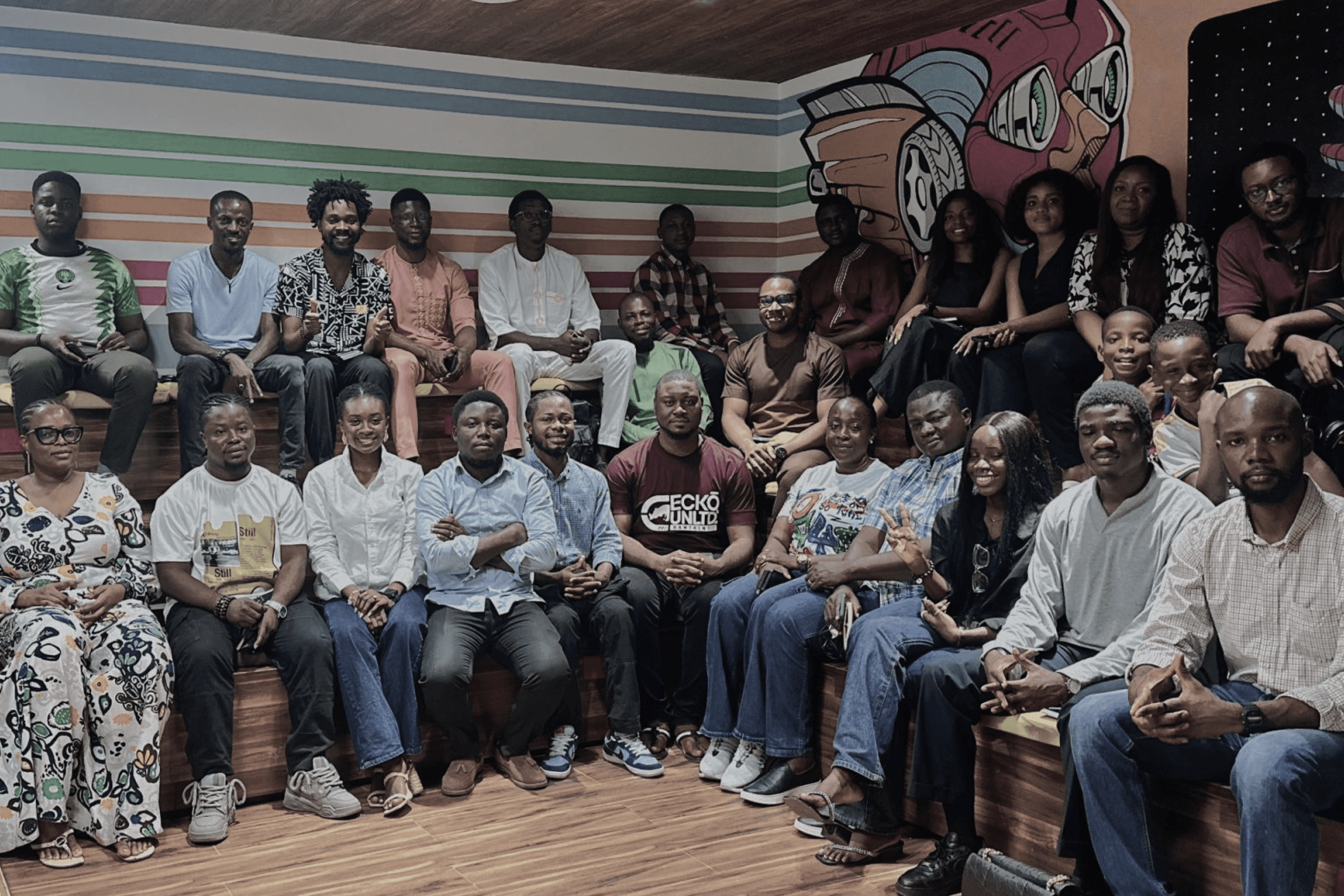
The PaymentLogue community meetup

The PaymentLogue Lecture Theatre

Coaching Session at The PaymentLogue

The PaymentLogue community meetup

Overview of the brand's previous brand materials.

The PaymentLogue old logo
The previous visual outlook lacked the cohesion and structure expected of a knowledge-driven brand. Designs felt fragmented, with inconsistent typography, layouts, and styling across materials.
Instead of presenting a unified identity, the brand appeared as a collection of unrelated promotional graphics, making it difficult to recognize The PaymentLogue as a
structured and authoritative platform.
The tone further reinforced this issue. Most visuals prioritized course advertising over thought leadership, resulting in cluttered layouts and unclear hierarchy. For a platform built on simplifying complex fintech concepts, the brand’s communication ironically felt busy and informal rather than confident and professional.
As a result, the identity did not support the ambition to be seen as the go-to source for fintech insight. The rebrand became necessary to replace inconsistency with clarity, and transform the brand into a sophisticated, credible, and unified presence.
The previous visual outlook lacked the cohesion and structure expected of a knowledge-driven brand. Designs felt fragmented,
with inconsistent typography, layouts, and styling across materials. Instead of presenting a unified identity, the brand appeared as a collection of unrelated promotional graphics, making it difficult to recognize
The PaymentLogue as a
structured and authoritative platform.
The tone further reinforced this issue. Most visuals prioritized course advertising over thought leadership, resulting in cluttered layouts and unclear hierarchy. For a platform built on simplifying complex fintech concepts,
the brand’s communication ironically felt busy and informal rather than
confident and professional.
As a result, the identity did
not support the ambition to
be seen as the go-to source for fintech insight. The rebrand became necessary to replace inconsistency with clarity, and transform the brand into a sophisticated, credible, and unified presence.

Logomark construction
The logo is designed as a symbol of structure, clarity, and authority in fintech education. Built from clean, minimal lines, it takes the form of an abstract architectural frame — suggesting foundations, systems, and organized knowledge.
The open base reflects accessibility and learning, while the strong, stable top
conveys credibility and institutional trust
with a restrained geometry that mirrors The PaymentLogue’s mission to simplify complex financial concepts into clear, practical insight.
The logo is designed as a symbol of structure, clarity, and authority in fintech education. Built from clean, minimal lines, it takes the form of an abstract architectural frame — suggesting foundations, systems, and organized knowledge.
The open base reflects accessibility and learning, while the strong, stable top
conveys credibility and institutional trust with a restrained geometry that mirrors The PaymentLogue’s mission to simplify complex financial concepts into clear, practical insight.


The PaymentLogues Logo


Component from
website design


Illustrations by Harrison Osagie
Illustrations on website by Ayoola Felix


Illustrations by Harrison Osagie

Illustrations on website by Ayoola Felix
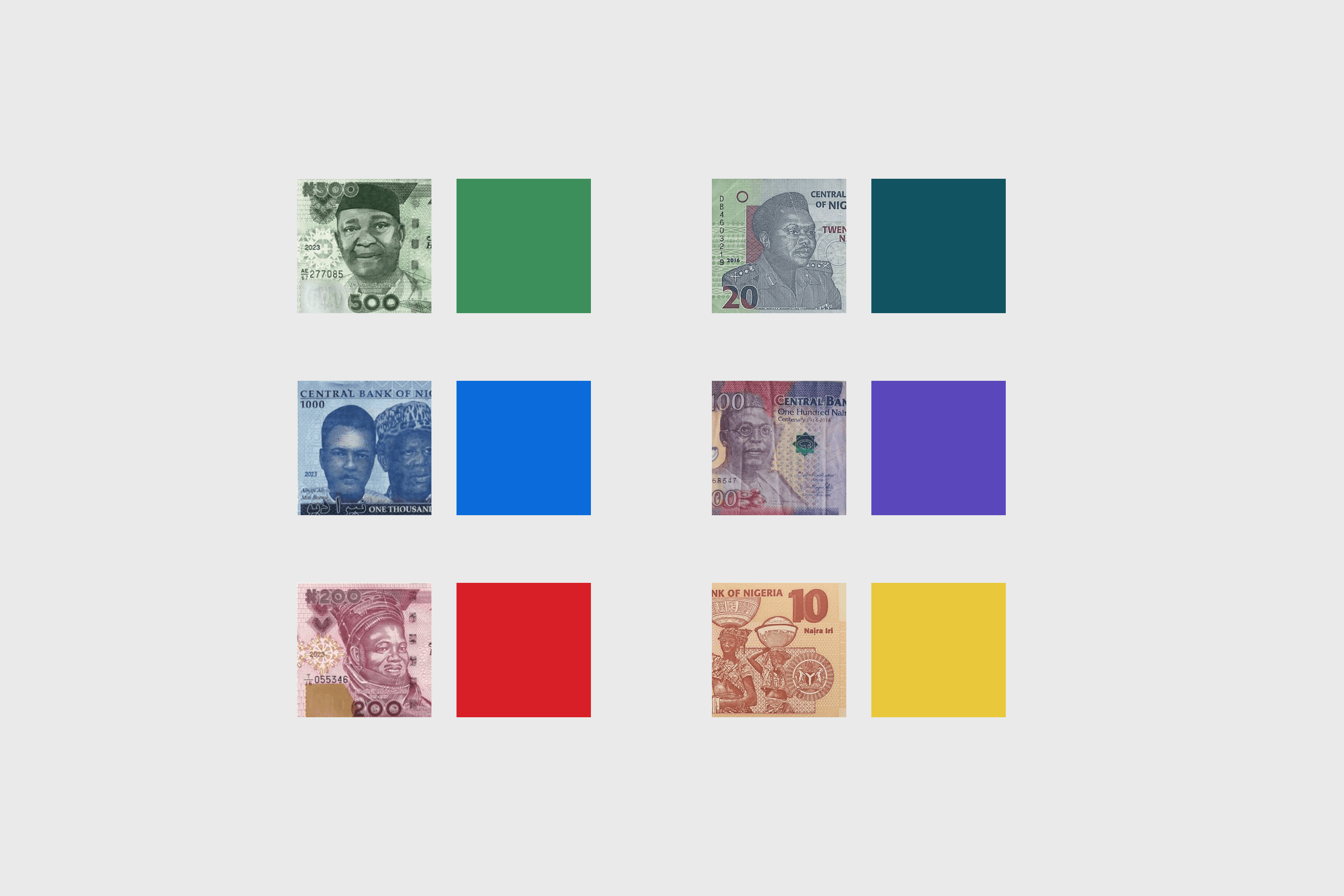
By deriving the palette directly from Nigerian currency, the color system anchors the
brand in the visual language of money itself, creating an intuitive, culturally relevant connection between fintech expertise and the everyday reality of finance in Africa.
Retaining the red from the previous identity was efficient because it preserves brand recognition and continuity, allowing existing audiences to maintain a visual link to the
brand while expanding the system with a more sophisticated, structured palette.
By deriving the palette directly from Nigerian currency, the color system anchors the brand in the visual language of money itself, creating an intuitive, culturally relevant connection between fintech expertise and the everyday reality of finance in Africa.
Retaining the red from the previous identity would be efficient because it preserves brand recognition and continuity, allowing existing audiences to maintain a visual link to the brand while expanding the system with a more sophisticated, structured palette.

Component from Website design

Component from Website design
Component from website design

The geometric structure of the logomark inspired the choice of the secondary typeface.


Illustrations on website
Illustrations by Harrison Osagie

Wallpaper design

Website design by Ayoola Felix
Component from Website design
Component from Website design

Website design footer section


Course certificate design
I’m an experimental designer, art director, philosopher, and writer from Lagos State, Nigeria.
My work explores the convergence of design, philosophy, and technology, that continuously pushes the boundaries of conventional
graphic design.
I strive to flex across a range of visual languages, often involving a focus on Art direction, typography, motion design, and conceptual thinking.
I’m an experimental designer, art director, philosopher,
and writer from Lagos State, Nigeria.
My work explores the convergence of design, philosophy, and technology, that continuously pushes the boundaries of conventional graphic design. I strive to flex across a range of visual languages, often involving a focus on Art direction, typography, motion design, and conceptual thinking.
Curretly
Designer Belonwus
Competencies
Graphic design, Art direction, Identity design, Motion design, Packaging
design, 3D design, Website design, Editorial design, Data Visualization,
Iconography, Illustrations, Poster design.
Graphic design, Art direction, Identity design, Motion design, Packaging design, 3D design, Website design, Editorial design, Data Visualization, Iconography, Illustrations, Poster design.

This is an exercise in reductionism, as without constraints there is no creativity.